Key Takeaways
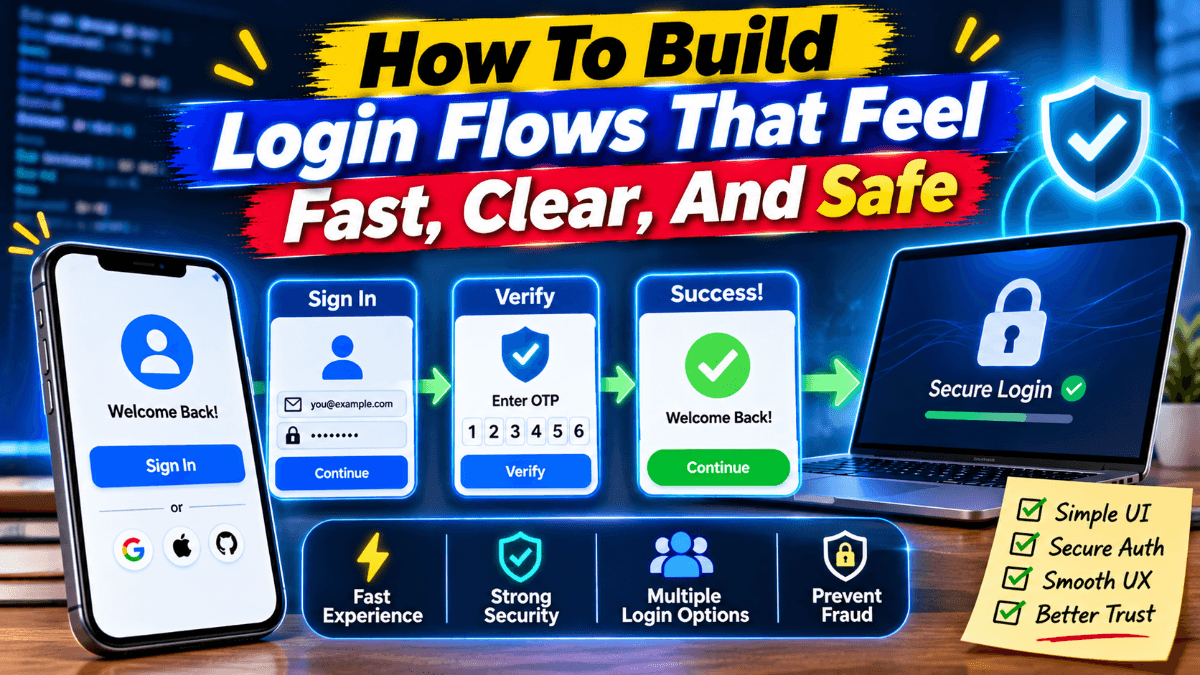
- A good login flow helps users access their accounts quickly and confidently.
- Simple forms, clear labels, and familiar authentication options reduce friction.
- Helpful error messages and recovery steps make sign-in problems easier to resolve.
- Accessible, mobile-friendly design supports users with different needs and devices.
- Security measures should match account risks without creating unnecessary barriers.
- Testing the full journey and tracking key metrics helps teams improve login performance.
A login flow is often the first meaningful interaction a returning user has with a product. They may be trying to review an order, continue work, download a document, or manage an account. If access feels slow or confusing, the user’s original task is interrupted before it begins.
Strong authentication experiences make the next step obvious, preserve momentum, and provide help when something goes wrong. Reviewing examples of login page design can help teams spot familiar patterns, but the best flow is the one that fits the user’s task, device, and level of risk.
Table Of Contents
- Why Login Flows Matter
- Start With User Goals
- Keep The First Step Simple
- Reduce Friction With Smart Options
- Make Errors Easy To Fix
- Design For Accessibility
- Balance Speed And Security
- Test The Full Journey
- Metrics That Reveal Problems
- Login Flow Checklist
Why Login Flows Matter
Authentication should support the user’s goal rather than become the goal itself. A customer who returns to retrieve a file should not have to decipher an ambiguous error, request multiple codes, and start over after a failed attempt. Every unnecessary decision or unexplained interruption can reduce confidence in the service.
Start With User Goals
Map the jobs users need to complete before choosing layouts or authentication methods. Some people know their password; some rely on a password manager or passkey; some are signing in from a new device; and others need account recovery. These are different situations, so a single rigid path will not serve every user equally well.
The Digital Identity Guidelines describe authentication alongside considerations for security, privacy, usability, and customer experience. In practice, that means selecting the least burdensome path that still matches the sensitivity of the action and the risk involved.
Keep The First Step Simple
Ask only for the information needed to begin. For many products, one clearly labeled email address, username, or phone number field is easier to understand than a screen filled with competing sign-in choices. The next action should be visible, the field should support autofill, and the keyboard should suit the expected input on mobile devices.
Questions To Ask During Review
- Can users immediately tell what they need to enter?
- Can they predict what will happen after they continue?
- Can they finish the first step comfortably with one hand on a phone?
Reduce Friction With Smart Options
Passwords, passkeys, one-time codes, and federated sign-in can all be useful, but presenting every option with equal weight may create choice overload. Lead with the method most likely to help the user succeed, then make suitable alternatives easy to find. A known returning user may prefer a passkey, while someone on an unfamiliar device may need a different approach.
- Keep entered identifiers after an error.
- Let users reveal or hide password text.
- Allow password managers to recognize the relevant fields.
- Make one-time codes easy to paste where appropriate.
- Ensure the flow remains understandable on slow or unreliable connections.
Make Errors Easy To Fix
“Something went wrong” is rarely enough guidance. A helpful message identifies the problem in plain language and provides a next step, such as requesting a new code or checking the entered email address. Place recovery help near the field or step where it is needed, rather than hiding it at the bottom of the page.
Error handling should cover incorrect credentials, expired codes, too many attempts, unfamiliar devices, and loss of access to an email address or a phone number. Messages can protect privacy without leaving people stranded. For example, a service can avoid confirming whether an account exists while still explaining how to try again or begin recovery.
Design For Accessibility
Accessible login design helps people who use keyboards, screen readers, Zoom, voice input, or small touchscreens. It also helps users dealing with glare, noise, temporary injury, fatigue, or a poor connection. The WCAG 2.2 standard provides testable guidance for areas such as labels, focus, contrast, input errors, and accessible authentication.
- Complete the journey with a keyboard only.
- Check that every field has a useful screen-reader label.
- Keep focus indicators visible and touch targets usable.
- Test at 200 percent zoom and in mobile portrait orientation.
- Do not rely on color, visual puzzles, or memorization alone when another method is available.
Balance Speed And Security
Fast does not have to mean weak. Risk-based checks can add protection when conditions warrant it, such as a new device, unusual activity, or a sensitive account change. Device recognition, rate limits, step-up verification, session timeouts, and account recovery all have a role when they are applied thoughtfully.
Useful security explains the extra step without exposing internal detection rules. Tell users that a check is needed to protect their account, provide a clear way to complete it, warn them before inactivity ends a session, and make sign-out controls easy to find. Security theater adds friction without giving users a meaningful path forward.
Test The Full Journey
Testing only a successful desktop login misses the moments where users need the most help. Test returning mobile sign-in, password-manager use, expired codes, recovery, session timeout, and access from a new device or location. During usability sessions, ask participants what they expect to happen before they select an option. Hesitation, backtracking, repeat attempts, and support questions often reveal problems that a completion result alone will not show.
Metrics That Reveal Problems
Measure successful sign-ins, time to authenticate, recovery completion, code failures, abandonment at each step, access-related support contacts, and repeated attempts from the same user or device. Review results by browser, device type, location, and authentication method. A high completion rate can still hide a frustrating process if people need several attempts before they succeed.
Login Flow Checklist
- Are labels brief, specific, and easy to understand?
- Can users identify required information and the next action?
- Does the experience work well on a small screen?
- Can users recover without losing progress?
- Are errors specific, private, and actionable?
- Are appropriate authentication alternatives available?
- Does the flow work with keyboards and assistive technology?
- Are additional security checks explained plainly?
- Can the team measure success and failure at every stage?
Conclusion
A strong login flow feels calm, clear, and dependable. It recognizes that authentication is a complete journey, not a single form. When teams simplify choices, support recovery, build for accessibility, and apply security in response to real risk, users can spend less time trying to get in and more time doing what they came to do.