A folder full of photos can make a website project feel almost finished. Then you start placing those pictures on the page. The shop photo is too tall for the banner. The product shot has no room for a heading. A perfectly good picture of your workspace turns into a confusing blur when it appears on a phone.
Taking more photos might help, but it isn't always the first thing to do. Often, you already have useful material. You just need to decide what each picture should do and prepare it for that job.
For a small business, that can be a manageable afternoon task. Start with one page, choose a handful of honest, clear photos, and work through them in order. Here's a practical way to do it without turning a simple website update into a full design project.
Start with the space on the page
Before opening an editing tool, look at the page you're updating. Where will the picture go? What will sit beside it? What should a visitor understand after seeing it?
A homepage banner might introduce your shop and leave space for a short heading. A product image should make the item easy to inspect. A photo beside your About section should help visitors recognize the person or place behind the business.
Those are different jobs, so they don't need the same treatment.
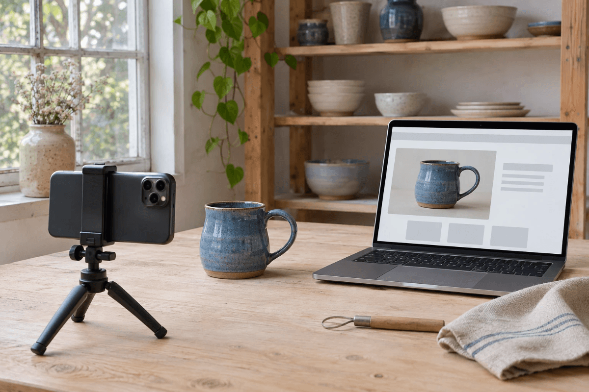
Suppose you run a small pottery studio. A wide picture of the workbench could work near the top of the homepage. A closer shot of a mug belongs beside its description. A photo of someone shaping clay might fit the section about your workshops. Trying to use the mug close-up in all three places would leave you fighting awkward crops.
If your website already has image spaces, note their proportions before you begin. Even a quick sketch with boxes marked “wide,” “square,” and “portrait” can save a surprising amount of back-and-forth later.
Choose the photo that needs the least rescuing
It's tempting to pick your favorite picture and assume editing will sort out the problems. For website work, the more useful question is whether the photo shows what visitors need to see.
Check that the main subject is in focus, reasonably well lit, and large enough in the original file. Look for distracting objects around its edges. Make sure the photo still represents what you're selling or the place people will visit.
For a product, compare the picture with the actual item. The color, shape, finish, label, and included accessories all matter. A prettier image is a poor trade if it creates the wrong expectation.
Keep the original files in a separate folder. Work on copies and give them names you can recognize later, such as “blue-mug-product” or “studio-homepage-wide.” You don't need a complicated filing system. You just need to avoid losing the untouched version halfway through the job.
If a photograph is badly blurred or hides an important feature, taking it again can be quicker than trying to repair it. A few minutes beside a window may solve more than a long series of edits.
Give each edit a small, clear job
Once you've chosen a photo, write down the change it actually needs. “Make it better” leaves too much open. “Simplify the background and leave space on the left for a heading” gives you something you can assess.
If you want to try an AI image editor online, Nano2Image is one option for exploring changes to an existing photo. Keep the task narrow, review the result against your original, and decide whether the edit helps the page before trying another variation.
For example, imagine a photo of a handmade notebook on a crowded desk. You might want a simpler setting so the notebook stands out. Your brief could say: “Use a plain, softly lit desk background. Keep the notebook's cover, binding, proportions, and printed text unchanged. Leave some clear space on the right.”
That instruction describes your intention; it doesn't guarantee the result will preserve every detail. Zoom in afterward. Check the lettering, corners, stitching, reflections, and anything that helps identify the item. If those details change, reject the version or return to a simpler edit.
Avoid stacking several unrelated requests into one attempt. A new background, a different camera angle, extra props, and dramatic lighting can make it hard to see what went wrong. One useful change at a time is easier to judge.
Make the set look like it belongs together
Individual photos can look good and still feel mismatched on the same page. One might have warm yellow light, another a cool blue cast, and a third a very dark background.
Choose a modest visual direction before preparing the whole set. For the pottery studio, that might mean soft daylight, quiet backgrounds, and natural colors. A bright stationery shop might suit a cleaner, lighter look with a little more color.
Use one finished image as a reference while you work on the others. Compare the overall brightness, how much space surrounds the subject, and whether the colors feel believable. You don't need identical photos. You need a collection that feels comfortable together.
Be careful with heavy filters. They can make a mixed set feel consistent, but they can also hide texture or change the appearance of products. When accuracy matters, a slightly less polished photo can be the more useful choice.
Leave room for the words
A common banner problem has little to do with photo quality: there's nowhere to put the heading.
If the subject fills the entire frame, adding text can cover the most useful part of the picture. Look for an image with a quieter area beside the subject, or choose a layout that places the text outside the photo.
For a workshop page, you might keep the hands and tools on one side and use the other side for a short invitation. But check the mobile version before committing to it. A wide image may be cropped tightly on a narrow screen, removing the empty space you planned to use.
Put headings and buttons into the website itself whenever possible. Baking them into the image makes later changes harder and can leave the words tiny on a phone. Keeping them separate also gives you more flexibility when the layout changes.
Export for the actual use
After editing, create the version the website needs. Avoid uploading a huge original just because it's available, and avoid enlarging a tiny image to fill a large banner.
Use your website builder's recommended dimensions as a starting point. Save a copy at the right proportions, then check the result at the size visitors will see. A small preview can hide rough edges, while an unnecessarily large file can add weight without making the page noticeably clearer.
Choose a format your site supports. JPEG or WebP can suit many photographs; PNG is useful when you need transparency. The best choice depends on the image and how the site processes uploads, so compare the exported version rather than relying on the file extension alone.
Keep your editable or high-quality source copy. If you later need a different crop for another page, you can return to it instead of repeatedly saving a compressed version.
Check the page, not just the picture
The final test happens inside the website. Open the page on a laptop and a phone. Read the heading, look at the image, and see whether the next step is obvious.
Does the crop hide anything important? Is the text easy to read? Can someone understand the product without zooming in? Does the photo support the description beside it?
Add useful alternative text where the image communicates information. Describe what's relevant to the page, such as “Blue ceramic mug with a curved handle,” rather than filling the field with search terms. Decorative images may need different handling in your website builder.
Finally, ask someone unfamiliar with the page what the picture tells them. If their answer matches what you're trying to communicate, you've probably made a useful improvement. A small business website doesn't need every photo to look like an advertising campaign. It needs images that help people understand the business and feel comfortable taking the next step.