Look at any developer's laptop at a meetup and you can read their résumé without asking a single question. A Linux penguin near the hinge, a language logo from a conference two years back, a half-peeled sticker from a framework that has since changed its name. These little rectangles are part of how the dev community talks to itself. If you maintain an open-source project, run a hackathon, or build a product for developers, getting sticker printing right is a small task that behaves a lot like shipping code: the output only matches your intent if the input is prepared properly.
Why Developer Communities Love Stickers
Swag has a long history in open source. Stickers are cheap to produce, easy to mail, and they ride along in backpacks to places a README never reaches. A well-designed logo sticker does three jobs at once:
It gives contributors something physical for their effort, which matters when most open-source work is unpaid.
It spreads project awareness to people who never saw the repository.
It gives a conference booth something worth stopping for.
Projects that hand out stickers at meetups or ship them with merged pull requests tend to build loyalty well beyond what a thank-you comment does. The cost per unit is low enough that even a small project funded by donations can afford a modest run.
Treat Your Design File Like Source Code
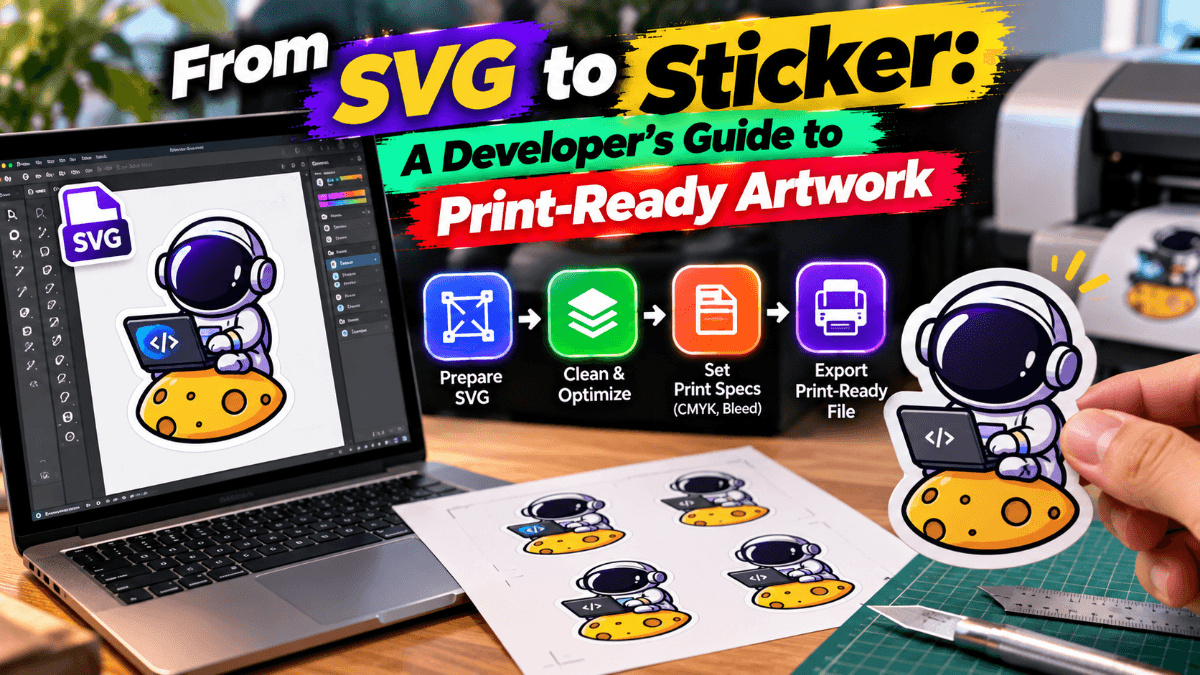
Most disappointing print results come from the same mistake: sending a file built for a screen to a machine built for ink. The fixes are mostly habits that developers already have.
Start With Vector, Not Raster
A logo exported as a PNG at web resolution will look soft when printed at sticker size. Vector formats such as SVG, PDF, or EPS scale without losing sharpness, much like resolution-independent layouts in CSS. If your project's logo only exists as a raster image, redrawing it as a vector is a one-time task that pays off for every future print run, banner, and slide deck.
Think in CMYK, Not RGB
Screens emit light in RGB. Printers mix ink in CMYK. Some vivid screen colors, particularly bright blues, neon greens, and saturated purples, fall outside what ink can reproduce, so the printed version looks duller. Convert your artwork to CMYK early and check how the colors shift before you commit to a large order. Think of it as testing in the production environment instead of only on your local machine.
Convert Text to Outlines
If your design includes text set in a custom font, convert it to outlines before sending the file. Otherwise, the printer's system may substitute a fallback font, and your carefully chosen typeface gets replaced, the print equivalent of a missing web font.
Set Up the Cut Path and Bleed
A die-cut sticker follows a custom outline, and that outline normally lives in the file as a separate path or layer. Most print workflows also expect bleed, an extra margin of artwork that extends past the cut line so tiny cutting variations never leave a white sliver at the edge. Typically that is a few millimeters, though your printer's specification is the one to follow.
Design Choices That Survive Print
Some tricks that look great on a dark-mode interface fall apart on adhesive vinyl.
Avoid hairline strokes. Very thin lines can vanish or break up in print. Keep line weights generous.
Watch small text. Anything that needs zooming in to read on screen will be unreadable at a two- or three-inch size.
Limit gradients and fine shadows. They can band when printed. Flat colors with strong contrast usually look sharper and age better on a laptop lid.
Check contrast against likely surfaces. A sticker will end up on silver aluminum, black plastic, and clear glass. A white outline around the artwork helps it hold up on dark backgrounds.
Choosing Material and Finish
A sticker meant for a laptop lid faces different wear than one on a water bottle or a bike frame.
Vinyl handles moisture and daily handling, which suits laptops, bottles, and anything that travels.
Matte finishes reduce glare and fingerprints, and they photograph well for social posts.
Gloss finishes make colors pop but show scratches sooner.
Waterproof and UV-resistant stock matters if the sticker will live outdoors.
Ordering Without Wasting a Run
Treat your first order the way you would treat a staging release. Start with a small batch, check how the colors and cut look in person, and fix anything before ordering in bulk. Printers that take both short test runs and larger reorders make this much easier, and Eplot's sticker printing service is built around exactly that kind of flexible quantity. It lets a project start with fifty stickers for a local meetup and scale to thousands once the design proves popular.
A few practical tips before you hit order:
Keep a master vector file and a version-controlled folder of approved print assets.
Request a proof when the printer offers one.
Order a little more than your estimate. Stickers get handed out faster than anyone expects.
Note the exact specifications of your first successful run so repeat orders match.
The Takeaway
Stickers have lasted in developer culture because they are small, cheap, and personal. The craft behind a good one is closer to engineering than most people realize: clean vector source files, correct color mode, outlined text, and a properly defined cut path. Get those basics right and the result is a piece of project identity that people choose to carry around for years. Whether you are launching a library, organizing a hackathon, or just making something for your own laptop, a little attention to sticker printing turns a quick design idea into swag people actually want to stick on their gear.